In 1969 I was living in a draft resistance commune in Brooklyn, NY. I think there were 6-10 people living there, with people coming and going, only a few of whom had a paying job. I worked at St. Crispin's Press when it was mainly creating upscale personalized stationery with a letterpress. My employer was Igal Roodenko, an elder at the War Resisters League. He was paid well for the personalized stationery we made.
I learned letterpress skills from Igal and he advised me on creating my book. I chose the typeface -- Palatino, a cross between serif and sans serif type which I love to this day -- and hand-set every letter of the type, all planned out in pagination ahead of time (on a little model) so they could be printed two-up and assembled into signatures that could then be bound. I printed the text pages of my book after hours on the St. Crispin's letterpress that I used at work.
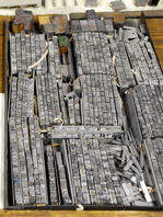
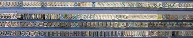
We had very old type cases -- boxes of type, leading, and brass and copper spacers, that looked sort of like those on the left, and
the press I/we used looked something like the one on the right. I could set the speed of the rollers so that I would have time to put the paper in place before the inked print was pressed onto the paper. I became better and faster with this process over time. I also became faster and better at setting type in a composing stick (below)
This was a bit of an art, because I was not just communicating words. I wanted the actual printed words to look as good as possible -- something I'd been trained to do while making expensive letterhead and envelopes in my work. I'd do my best guess of the proper spacing between letters, then I'd run a sheet and notice where the letters looked too crowded or spacious, and then add or subtract these little rectangular copper or brass spacing chips between the letters and do another trial. Learning which letters tended to be too spacious together (L and T, for example) or too tight (such as "i" and "l") sped up this process. But I did a lot of work on the spacing of each pair of pages of poetry before I was satisfied they looked right and then could print my 30 copies of that pair of pages.
The yin-yang series I had dreamed up earlier in pen-and-ink in a notebook. I decided to combine them with poems I had written in the last five years or so before that. The pictures were carved into linoleum blocks, something I'd never done before, but found to be very enjoyable, requiring a lot of care, control and concentration, but being much more controllable and responsive than wood blocks. The blocks were actually a layer of linoleum glued onto a wooden block, and the carving was done with a set of mostly v-shaped blades (with U-shaped blades for cutting away more of the block). I actually took the print pages home to the commune and did the linoleum block printing at home. At the right is an example of how to do linoleum block printing. I could only do one or a few pages each day because I'd have the pages draped all over the living room drying!
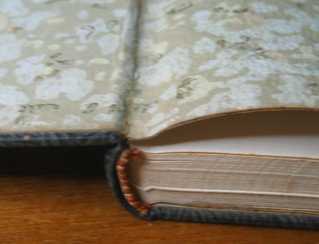
The pages were printed in pre-calculated pairs to allow folding and then sewing of "signatures". There was some book-binding equipment at the print shop. I did the book binding by hand as shown here. I don't remember all of how it went. It wasn't quite like all these videos, but I vaguely remember some aspects of it. At the left is a diagram of the layers of binding. On the right is one version of how the sewing is done and how the gluing is done -- although I also glued on the leatherette cover early on and then the end papers (wallpaper) at the end.
(Note: the original gluing video is no longer available; the one at the right is a substitute)


